
39 Walker Street
New York, NY 10013
+1 (212) 727 2050
bortolamigallery.com
Rebecca Morris: #35
30 Oct – 19 Dec 2026
BORTOLAMI
Bortolami is pleased to announce Tepe Gawra, the first solo exhibition at the gallery by acclaimed painter Vian Sora (b. 1976, Baghdad, Iraq; based in Louisville, USA). Sora is best known for vivid paintings in which pools of aqueous color jell into expressive compositions beset with sharp contours and subtle gradient shifts. Though her imagery is non-representational, there are fragments of figuration and text embedded in her works which allude to mythologies and histories of the ancient and contemporary world. It is the artist’s first exhibition of new works since opening her traveling museum survey show last year.
Sora’s works begin with pours of liquid acrylic on canvases placed face up. She introduces pigments to the medium, mixing them so that they bloom into streams of deeply saturated chroma. While still wet, they spread like hot magma across the surface of the painting. This process is executed in dozens of layers, achieving a vast range of surfaces from dense, crystalline textures to watery, atmospheric fields of color. Sora then applies oil paints, creating freehand, hard-edged shapes resembling a broken cuneiform or Arabic calligraphy.
This exhibition takes its title from the ancient Mesopotamian settlement, Tepe Gawra, located in what is present-day Iraq; Sora visited the site as a student. Excavations of Tepe Gawra have uncovered objects from 4900-4000 BCE which are adorned with lapis lazuli, the rich blue historical pigment also known as ultramarine. As it was sourced from over 1500 miles east of Mesopotamia, it is evidence of one the earliest known trade routes and a marker of cultural exchange in the region.
Just as the advanced human society migrated outward from the so-called “cradle of civilization,” so too, did the export of ultramarine blue from Central Asia into Europe. During a residency last year in Umbria, Italy, Sora was reminded of the impact of lapis lazuli on the Western art canon. It was famously used in works by Giotto, Piero della Francesca and others whose patrons could finance even the sparest use of blue: mined in Afghanistan, processed into pigment and imported through Venice.
In Tepe Gawra, Sora has used lapis lazuli throughout each work, both in the beginning stages of acrylic staining and the uppermost layers of oil in her compositions. In Tigris refrain, Sora recalls scenes from childhood visits to her grandfather’s home in Baghdad on the banks of the river. In Inflorescence, a deep ultramarine field envelops oranges, violets and greens emerging into coral-like patterns. And in Streams of lazouli, angular punctuations of blue surround a tempestuous palette of organic yellows, greens and violets, made as Sora contemplated the increasingly disconcerting attitudes within the U.S. towards immigrant communities such as hers. Scarlet, a limited palette painting with metallic hues and subtle blues overlaid with crimson red, reflects a new direction for the artist – an emphasis on texture and objecthood in her painting and a nod to the artist’s more sculptural leanings. The exhibition’s largest work, Tamarisk (Purification), is over 12 feet in length. Its expansive horizontality and frenzied mark making disarm as much as its cool palette of violets, greens, and yellows soothe. It is not a depiction of creation nor destruction but an encapsulation of both.
Bortolami is pleased to announce Rebecca Morris’ third exhibition with the gallery and her thirty fifth solo exhibition overall. Morris continues to probe the vast range of oil paint’s material possibilities, utilizing decades of experimentation with thin, aqueous color to push the boundaries of what is possible in contemporary painting.
The wildly divergent range of outcomes in Morris' paintings are increasingly reliant upon the subtle but transformative variation of pressure from her own hand: a brush, soaked with paint, gliding along a rough, unsanded gesso ground; the splintered remains of oil stick pressed firmly into the weave of canvas; or a thick, impasto sculpted into line and spray painted to emulate molten silver, brass, or gold. Conversely, other paintings are produced by far more indirect means. Many of Morris’ works begin with pours of liquefied paint and mineral spirits, pooling as the canvases are laid flat, drying overnight in the stillness of the atmosphere in her studio. Others are replete with incidental splatters and run-off from other paintings which have fallen onto a primed canvas dropcloth, placed strategically on the studio floor.
Once a painter famed for a limited and unsaturated a of blacks, browns and silvers, Morris has continued her progression into a colorist. In several monochromes, she goes for an all-out commitment to color field painting, testing the different potentials of a hue as if each canvas was a new character study. Untitled (#03-26) is her latest attempt to create what she calls an "ultimate red painting.” For Morris, it is an earnest if impossible attempt to fully unlock all of the sublime power the color has to offer. With a wide brush, she has applied large swaths of an intense if inscrutable crimson, mixed just enough to avoid leaning warm or cool. It has been thinned just enough to maintain a semi opacity, doubling in intensity as her brushstrokes overlap. It surrounds cloudlike clusters of pink, diluted even further. The faint striations of bright white gesso recall the veins of marble.
In Untitled (#08-26), a sea of blue and green is overlaid with a jagged, metallic silver line which is further embellished by an outlined gold drawn underneath, as if to emphasize its already outsize, electric impact.
Untitled (#02-26) is made with a more otherworldly blue-green, homogenous in hue but layered in successive stains. In each stage of the painting, Morris alters the saturation with magisterial aplomb, creating a complex and disorienting depth of field. If the former feels like spectating color from afar, the latter invites a more first-person immersion within the painting.
Untitled (#05-26) is all touch, its shapes and lines drawn using a round brush, loaded with an iridescent pink taupe, a barely-there color that seems to dance on top of the stark gesso ground like sunlight reflected onto water. Morris dots these shapes in a cobblestone formation which are punctuated with magentas as vivid as stained berries.
In the exhibition, Morris’ vast array of idiosyncratic and pseudo-geological patterns, so prevalent in past paintings, have here been compartmentalized into smaller, ornate configurations. This sparing quantity has been used to potent effect. In (To be titled? I could not find it), they are enveloped in a black-and-white field recalling the dissonant motifs of some of Morris’ early 2000s works; Untitled (#15-26), in which a constellation of jewel-like shapes emerge from a uniquely lavish metallic lilac ground; and Untitled (#01-26), in which a grid of different textures and colors is inset within a uniquely atmospheric gold checkered with scribbled, red accents in oil stick.
The most experimental of Morris’ new paintings, (Untitled #13-26), foregrounds a large, cryptic shape that the artist has referred to as a “mono-claw.” A primitive and enigmatic shape, it reads like a portal leading to a distant vista of stone-like textures rendered in a neutral palette which briefly, in inexplicably, diverges into warm and cool tones. At the foot of the composition, the same colors are arranged in a grid of scratchy mark-making, as if this index might provide some clue to the origins of this painting’s complex system of logic.

––––––––––––––––––––––––––––––––––––––––––––––––––––––––––––––––––––––––––––––––––––––––––––––––––––––––––––––––––––––––––––––––––––––––––––––––––––––––––––––––––––––
Rebecca Morris, Untitled (#08-26), 2026
Oil and spray paint on canvas, 94 x 94 in (239 x 239 cm)
$130,000


––––––––––––––––––––––––––––––––––––––––––––––––––––––––––––––––––––––––––––––––––––––––––––––––––––––––––––––––––––––––––––––––––––––––––––––––––––––––––––––––––––––
Rebecca Morris, Untitled (#03-26), 2026
Oil on canvas, 103 x 79 in (261.5 x 200.5 cm)
$130,000


––––––––––––––––––––––––––––––––––––––––––––––––––––––––––––––––––––––––––––––––––––––––––––––––––––––––––––––––––––––––––––––––––––––––––––––––––––––––––––––––––––––
Rebecca Morris, Untitled (#05-26), 2026
Oil on canvas, 89 x 89 in (226 x 226 cm)
$125,000


––––––––––––––––––––––––––––––––––––––––––––––––––––––––––––––––––––––––––––––––––––––––––––––––––––––––––––––––––––––––––––––––––––––––––––––––––––––––––––––––––––––
Rebecca Morris, Untitled (#07-26), 2026
Oil on canvas, 84 x 90 in (214 x 228.5 cm)
$120,000

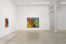


––––––––––––––––––––––––––––––––––––––––––––––––––––––––––––––––––––––––––––––––––––––––––––––––––––––––––––––––––––––––––––––––––––––––––––––––––––––––––––––––––––––
Vian Sora, Belladonna on Wet Lime, 2025
Oil, acrylic and pigments on canvas, 60 x 84 in (152 x 213 cm)
$55,000. Please inquire for current availability


––––––––––––––––––––––––––––––––––––––––––––––––––––––––––––––––––––––––––––––––––––––––––––––––––––––––––––––––––––––––––––––––––––––––––––––––––––––––––––––––––––––
Rebecca Morris, Untitled (#01-26), 2026
Oil on canvas, 63 x 63 in (160 x 160 cm)
$90,000


From Vian Sora, January 2026:
This exhibition emerged not from planning but from necessity, a convergence shaped by the compression of the last year, when time, attention, and responsibility collapsed into the work itself. What has surfaced feels less like a discrete body of work and more like a threshold, formed under pressure, accumulated rather than designed, insistent rather than resolved.
That pressure has a longer duration.
In 1991, during the first week back at school in Baghdad after the bombing of Iraq had halted, I was struck by a car. The accident left me unable to walk for three years. During that time, while moving on crutches and undergoing multiple surgeries, a friend of my mother’s gave me a book by Aldous Huxley. In an essay titled “The Best Picture,” Huxley recounts how a British artillery officer in World War II refused to shell the Italian town of Sansepolcro in order to spare Piero della Francesca’s Resurrection. A town survived because someone carried an image strongly enough to interrupt force.
The book was given as an act of care, but also of conviction. One day you’re going to visit that town, she said, directing a future toward a body that could not yet follow it.
Decades later, through a summer fellowship in Italy devoted to painting and sustained looking, I arrived in Sansepolcro. When I returned to the studio that day, I began the first work in this series.
There is a persistent tendency to read my work through fixed narratives, through history as event and identity as category. While that history is undeniably present, it does not define the limits of engagement. These paintings demand to be understood within the living field of contemporary practice, in dialogue with artists working now, across New York and beyond, who are similarly negotiating questions of abstraction, materiality, structure, collapse, and the politics of attention. This work belongs to the present tense.
Origin, here, is not biographical decoration but operational force. It functions before image and beyond explanation, not illustrated but exerted. Origin behaves less like memory and more like pressure, persistent, shaping form without announcing itself, carried forward rather than resolved. Within that pressure lives a visual vocabulary older than contemporary language, one rooted in Mesopotamia, not as reference or citation, but as foundational logic. Mark, weight, repetition, symbol. These impulses predate naming. They are not reproduced but continued, morphed through time, migration, and the present.
This body of work took further shape during a summer 2025 fellowship in Umbria, in close proximity to early Renaissance frescoes. There, I became acutely aware of how
color once functioned structurally. Lapis lazuli carried obligation. Reds and corals were materially specific, bound to mineral, labor, and time.
These were not expressive choices but physical commitments, often paired with gold to stabilize space and belief simultaneously. Those tones became the chromatic foundation of this exhibition, not as homage, but as a way of thinking about how matter accumulates meaning through duration.
The studio process begins at speed. Paint is pushed, destabilized, allowed to exceed control. Then the tempo shifts. The work slows into sustained, exacting refinement. Layers are erased and reasserted. Paths appear, dissolve, and reconfigure. Surfaces oscillate between collapse and precision. What appears immediate is the result of prolonged negotiation, faces shifting under the pressure of time, identity refusing to settle into singular form.
The work is ultimately concerned with transformation. Matter changes state. Form passes through instability into another condition. That logic extends beyond material. It informs how the paintings hold time, how they refuse fixed readings, and how they remain open to reconfiguration without dissolving into chaos. Surfaces remember and forget. The pressure of duration becomes visible.
Empathy, in this context, is not sentiment but attentiveness, the discipline of staying with complexity, opacity, and forms that do not offer quick recognition. These works ask for duration. They resist capture and instead construct a shared field of concentration between object and viewer, a space where faces shift not as instability but as truth, where time pressure becomes generative rather than destructive.
The paintings operate across multiple dimensions. Depth is optical, but also temporal and cognitive. Layers carry traces of cultural loss alongside cultural gain, not through translation or simplification, but through accumulation. The surfaces refuse immediacy. They require sustained engagement. They ask what remains after matter changes state, after paths lose definition, after control and instability learn to coexist, after a face has been seen, erased, and seen again.
These works do not propose stable routes or fixed identities. They operate through interruptions, erasures, and shifting trajectories. They hold structure inside disorder long enough for a position to form, not a position given to the viewer, but one that must be found, earned through attention, through the willingness to remain present as faces shift and time exerts its pressure. The work does not instruct. It holds space. It waits.
BORTOLAMI
Rebecca Morris (b. 1969 Honolulu, Hawaii; based in Los Angeles) is known for her inventive approach to composition, color, and gesture. Working primarily with thin, matte washes of color juxtaposed with shimmering, metallic impasto, Morris’ practice demonstrates a rigorous commitment to experimentation, combining seemingly disparate patterns and motifs to generate new outcomes and possibilities.
Morris was recently the subject of a solo exhibition, curated by Jamillah James, which traveled from ICA Los Angeles to MCA Chicago. Other significant solo exhibitions of Morris’ work have been held at the Blaffer Art Museum, Houston; Bonnefanten Museum, Maastricht, Holland; and The Renaissance Society, Chicago.
Her work has been included in group exhibitions at Mu.Zee, Belgium; Wexner Center for the Arts, Columbus, Ohio; Made in L.A. at the Hammer Museum, Los Angeles and The Whitney Biennial, New York. Her work can be found in the collections of the Whitney Museum, New York; Hirshhorn Museum, Washington, DC; Hammer Museum, Los Angeles; MoCA, Los Angeles; MCA San Diego; The Art Institute of Chicago; MCA Chicago; Carnegie Museum of Art, Pittsburgh, Pennsylvania; Speed Art Museum, Louisville, Kentucky; Sammlung Goetz, Munich, Germany; Bonnefanten Museum, Maastricht, Netherlands; and DePaul Art Museum, Chicago, among others.

39 Walker Street
New York, NY 10013
+1 (212) 727 2050
bortolamigallery.com